
The Transfer Portal: Visualized – A College Football Network Analysis
Preface
College football is changing, and rapidly.
Players can now be paid not only for their name and likeness (a development that frankly should have come much sooner), but even directly by schools themselves. The playoff was expanded from 4 to 12 teams. Conferences are no longer even nominally regional, but instead – under pressure from TV networks – have made the cynical decision to expand wantonly with total disregard for the myriad cultural traditions that made the sport special to begin with, and, much like the sterile, corporate NFL, have thoroughly abandoned all pretense of existing for any other purpose than to maximize profit.
Whether these developments, on balance, are good or bad for the sport depends on who you ask (if you’re asking me, it’s the latter), but there can be no doubt that American capitalism and its insatiable short-term appetite – dutifully kept at arm’s length for so long – is finally beginning to break down the door. True, there was always money to be made in college football, and certainly quite a lot was even before these changes, but at the same time there was an unspoken understanding that what we had here was not just special, but fragile, and required a certain degree of protection from the outside world if its unique character (and thereby its commercial value) was to persist. That understanding is no more, and the current direction of the sport is putting that delicate balance on a knife’s edge. As Michael MacKelvie puts it in this fantastic video,
“every sport and business deals with its own pendulum of product and profit, and right now, the powers at play within college football are dropping an Acme anvil on the product.”
This is a story about just one of those developments, and perhaps the most polarizing one: the transfer portal.
The transfer portal in its current form began on April 28, 2021, when the NCAA ratified a policy change allowing, for the first time, players to leave one team for another without being required to sit out a year in order to do so. While there is broad consensus that the portal has certainly had an effect, there is comparatively very little about what that effect has actually been. Some deride the portal as a degradation of the sport’s integrity, while others argue it has had a positive effect by acting as a clearinghouse that allows free circulation of talent.
As for me, I saw it a little bit differently. I am, of course, a major college football fan, but I’m also a data analyst and a student of network science, and if there is one thing that the transfer portal most definitely is, it’s a network. Given my uniquely appropriate background, I would have been remiss if I did not take it upon myself to capitalize on that fact. Using the database and API provided by CollegeFootballData.com, I was able to gather all the information I needed, convert it to network format, and – with only a small amount of annoying cleanup required – commence, to the best of my ability, with a comprehensive network analysis. What follows is the surprising, and fascinating, result.
Project Introduction + A Primer on Network Science
Before we begin, it will be prudent to give a brief rundown of what network science actually is for the uninitiated – along with the meanings of some of its associated terms.
At its core, network science is the study of connectivity. It moves the focus away from the individual characteristics of single entities and toward the relationships between those entities, analyzing the resulting “whole” as one new, consolidated entity: a network, which encodes in its relationships a high-level description of the entire system.
Networks are composed of nodes – individual entities or elements – and edges, the links between these nodes, which can be weighted by values representing the number of links between the same nodes, the “strength” of the links, or some other attribute. Edges can be either directed (meaning they “point” from one node to another) or undirected. Both nodes and edges can be imbued with any number of attributes. In the parlance of the field, “network” is often used interchangeably with “graph.”
Networks can also be bipartite, where nodes are given “classes” and nodes of one class can only connect with nodes of the other (used to model relationships like pollinator-plant, author-paper, etc). These networks can then be “projected” to turn them into a more traditional network isolating the nodes of either class, where edges between nodes in the projected network represent a node of the other class that they both share a link to in the original network (for instance, two genes that share an association with a particular disease).
Network science, then, is a field united as much by methodology as it is subject matter. It’s been used to study all sorts of subjects, ranging from disease transmission to the global financial system to synaptic connections between neurons in the brain.
In the context of the transfer portal, the application is rather obvious. Schools are the nodes and transferring players are the directed edges between them. Edges can be weighted either by the number of transfers or the ratings of the transfers. Each year/cycle since 2021 has its own network, and these networks can be compared and aggregated.
What’s more, even traditional recruiting can be represented as a network: a bipartite one, with schools on one side and recruit hometowns on the other. It can then be projected by school to identify shared recruiting grounds. In this case the usable data goes back much further (specifically to 2002). The recruiting network has some interesting findings, too – including one especially cool one – but we can save that for later. For now, we’ll just focus on the portal.
Anatomy of the Transfer Network
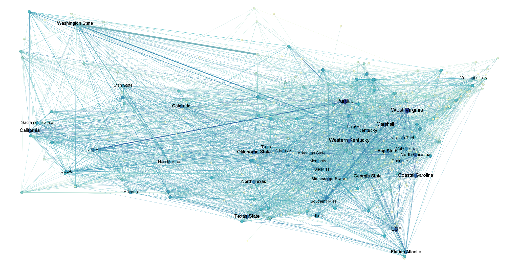
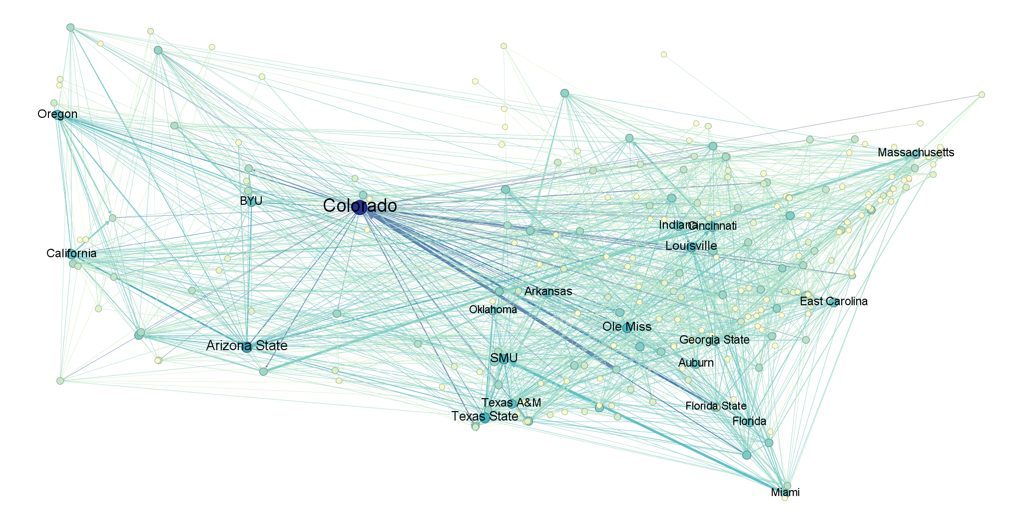
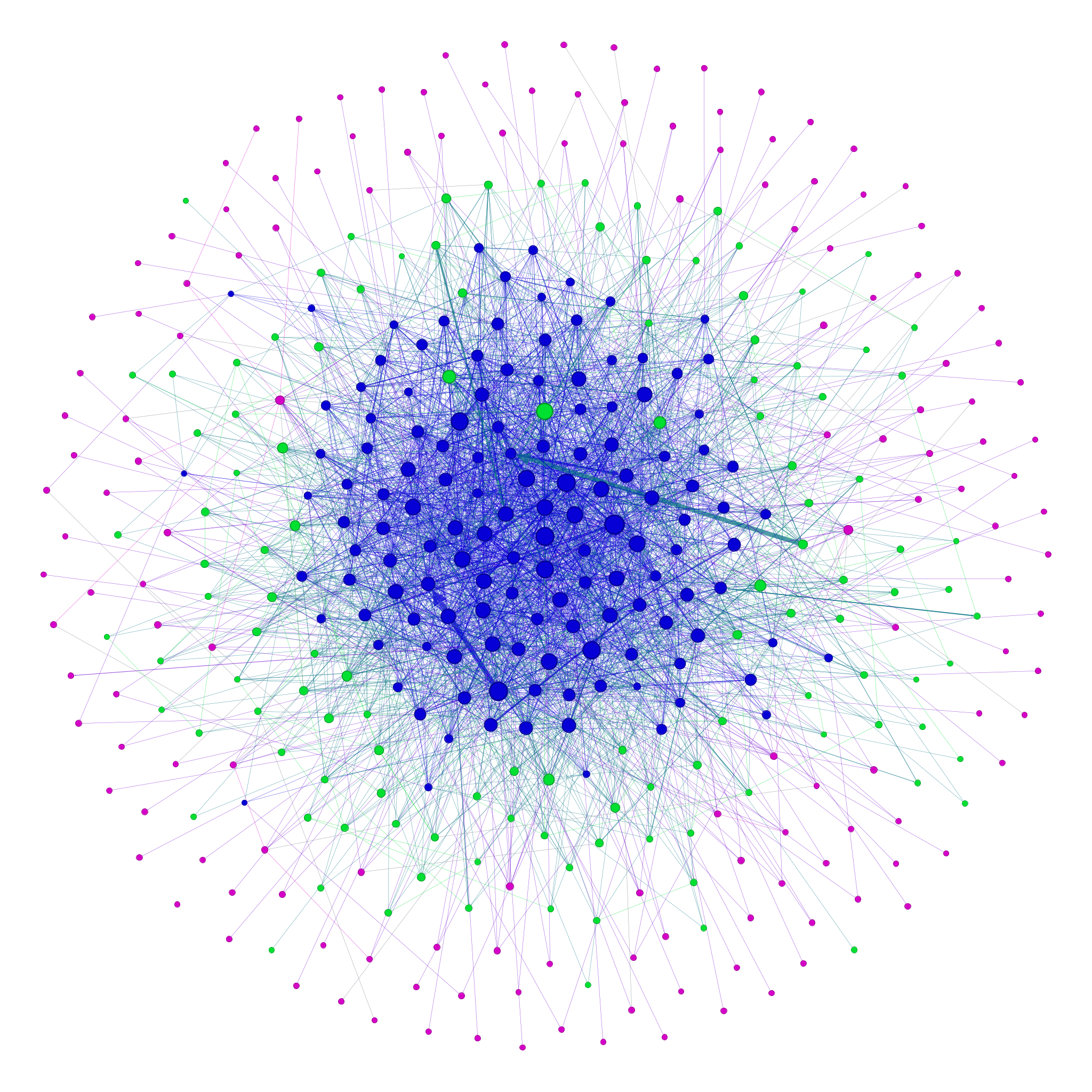
Here, at long last, is the full picture of the transfer portal in all its glory – in this case for the most recent year, 2025. Nodes are laid out geographically and sized/colored by their weighted degree (sum of connections), so that higher-degree schools are larger and bluer. For the sake of readability, I’ve restricted labels to only the highest-degree schools.
A couple fun things immediately stand out here: for instance, we can observe huge outflows from Marshall to Southern Miss and from South Dakota State to Washington State as a result of players following their coaches to new schools. We also observe that Purdue had an extremely turbulent year in the portal (high degree) following their abysmal 1-11 season and subsequent need to replace departing players.
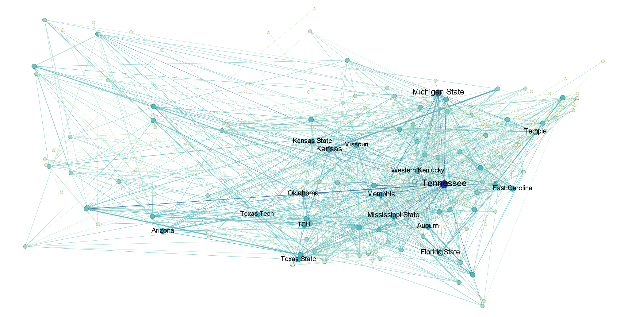
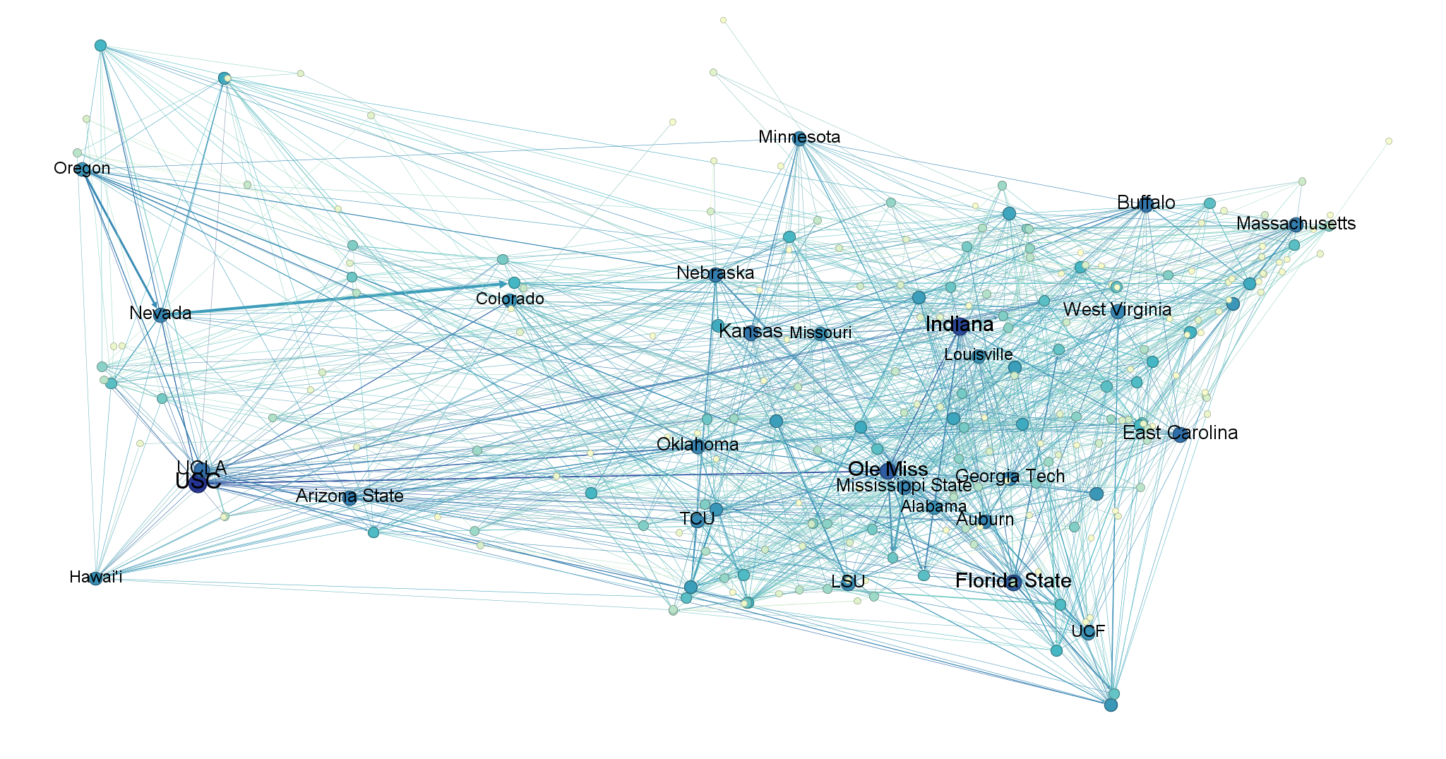
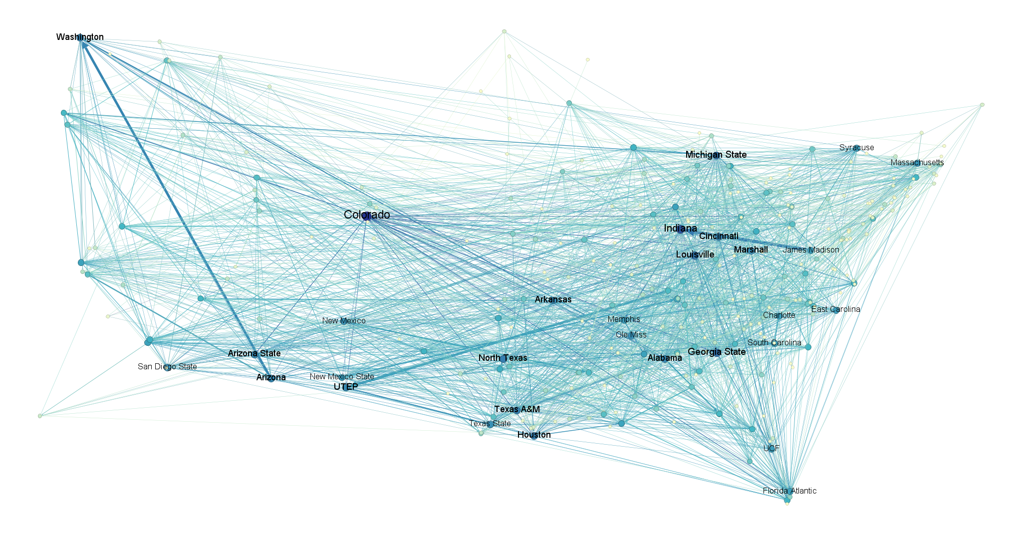
Here are the other four seasons, arranged in order from earliest to latest.
I. Topology (What kind of network is this?)
The structure of a network is called its topology. In nature, there are certain patterns or “classes” we generally observe in topologies, depending on the context of the network and the underlying process that created it. These can be found by obtaining certain network statistics, such as degree, clustering coefficient (the proportion of a node’s neighbors that are also neighbors themselves), density (the ratio of possible edges in the network to existing ones), and so on. For example, when a network is highly clustered and has a short average path-length (technically average shortest path-length) between any two given nodes, we categorize it as “small-world.” Small-world topologies are especially common in social networks, where the probability of two contacts being contacts themselves is relatively high. This creates a highly modular system comprised of many distinct clusters (if you’ve ever read “The Strength Of Weak Ties,” this is basically what that book is about).
Here are some aggregated statistics for our transfer portal networks (calculated as averages of averages so as to avoid privileging years with more data):
| Metric | Value |
|---|---|
| Average Path Length | 3.046 |
| Diameter | 6.8 |
| Average Degree | 11.17 |
| Average Clustering Coefficient | 0.0585 |
| Density | 0.0175 |
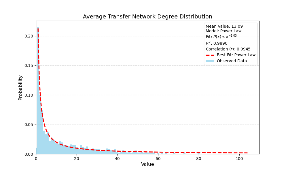
And here is their average weighted-degree distribution, which follows a power law with scaling exponent 1.03. This indicates a “heavy-tailed” distribution where the vast majority of programs have very few transfers, but a small number of high-activity ones engage in the portal at a much higher rate than average.
So what class is our transfer portal in? Like a small-world network, it features an extremely short average path-length of about 3 steps between any two programs, but its low density and low clustering coefficient means it cannot form the dense, localized communities that usually define the small-world class.
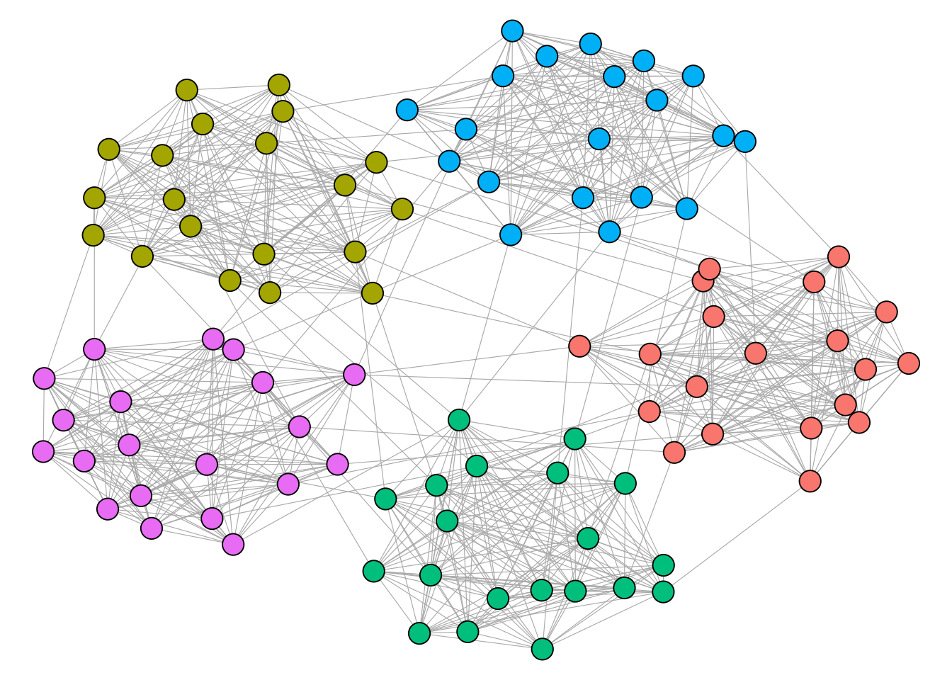
To find some clues, we can use the Fruchterman-Reingold algorithm – one of several “layout algorithms” used to visualize networks. It works by treating nodes as electrically-charged particles, pushing unconnected nodes apart and pulling connected ones together until an energy-minimizing “equilibrium” is reached. Applying this algorithm to our network and coloring the nodes by division (FBS blue, FCS green, lower divisions pink), we get this result:
There is a clear hierarchy between divisions, with D2 and D3 programs at the outer fringes of the network and FBS programs in the center. This reflects a pattern where teams at higher levels engage in the portal at a significantly higher rate, which makes sense given that players’ value on the market (not to mention the degree of priority they place on football) scales down with division.
This hierarchical arrangement allows us to confirm our topology: core-periphery. High-activity FBS programs at the center act as central hubs for the entire network, and because these “core” schools engage in the portal at such a high rate, they effectively collapse the distance between any two programs in the system. For example, a player might move from a D3 school to a mid-tier FCS program, while another moves from that same FCS program to a P4; this creates a path that connects the fringes to the summit in just two steps.
This explains why the transfer portal has such a short average path length despite having virtually no clustering, and why its degree distribution is heavy-tailed.
As for clustering, it is functionally nonexistent here because players select their next school based on factors that have nothing to do with their previous one (likely NIL, playing time, coach movement, etc.)
II. Centrality (Which schools are most important?)
In network science, we use a certain class of statistics – called centrality metrics – to obtain some measure of a node’s “importance” in a network. There are many such metrics to choose from, each of which defines importance in its own way. For this network, I have selected two: PageRank and HITS.
PageRank was initially developed as a search ranking algorithm by Larry Page and Sergey Brin and was the impetus for the founding of Google. It’s a way of measuring the importance of a node – in their case a webpage – by measuring the importance of its neighbors (via degree). It is designed specifically for directed networks, making it a natural choice here.
HITS, incidentally, was also originally made to rank webpages. It’s technically a combination of two metrics: a Hub score and an Authority score. These scores are somewhat recursive: Hub is a measure of a node’s propensity to point to nodes with high Authority, and Authority is a measure of how many high-scoring “Hubs” point back to that node, signaling that the node is a primary destination/store of value. For our purposes, we’re going to ignore the Hub score and just focus on Authority, since it will identify “sinks” – schools that act as prime destinations, which is what we’re after.
Calculating the centrality values for each node in the aggregated network, we get these results:
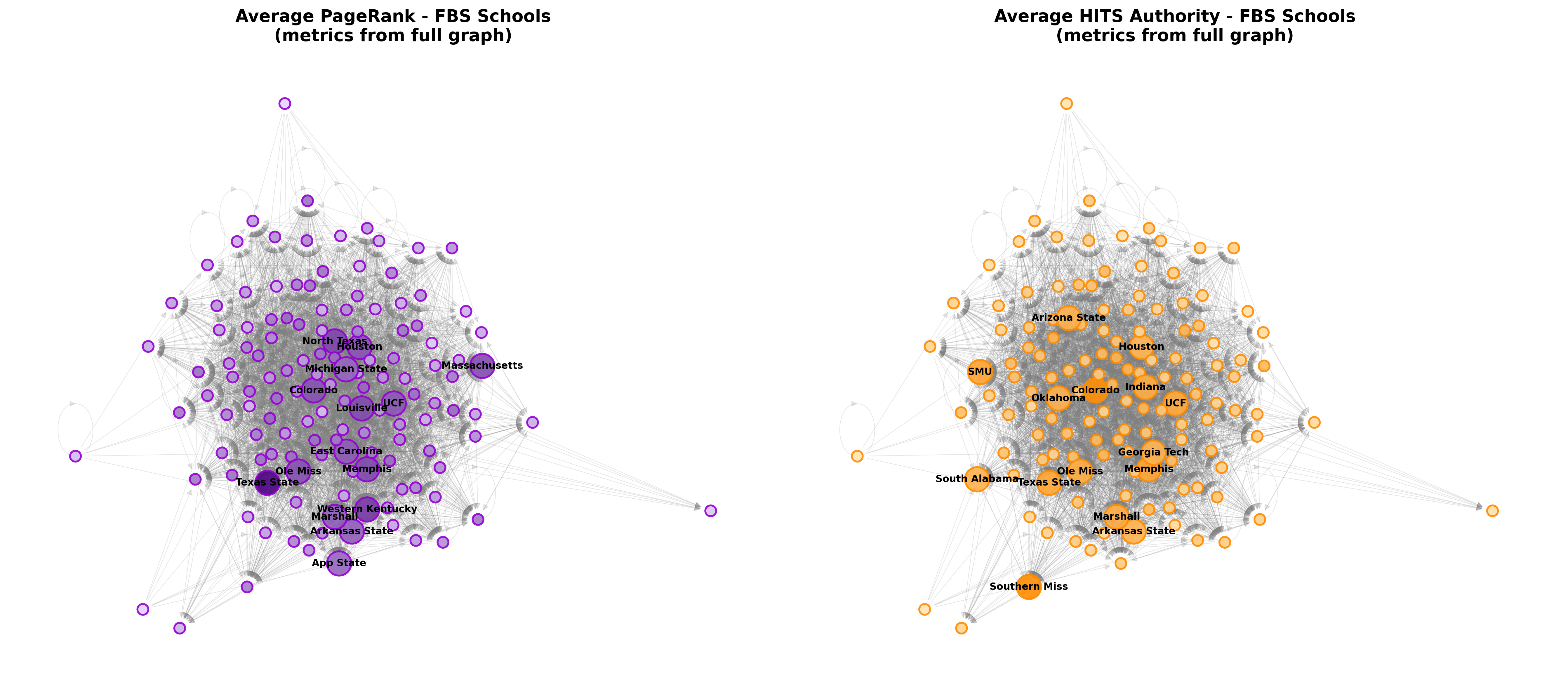
This is a visual representation of the top 15 schools by each metric, upscaled and labeled. Metrics are calculated from the full network, but the visualization algorithm was only run on the FBS subgraph to improve readability (and so that the script could finish running before the sun enters its red giant phase).
Because PageRank values a node based on the importance of its neighbors, it specifically highlights teams that take in players from other highly-connected, high-profile teams. This identifies the programs using the portal as a primary engine to completely overhaul their rosters with high-value talent in a very short window, which can be confirmed by a cursory glance and some prior knowledge about these programs’ recent histories.
The HITS Authority results, on the other hand, highlight programs with high “prestige” in the portal, that is ones which act moreso as ultimate endpoints. Schools high in Authority represent the premier destinations in the network. They are the schools that transferring players have collectively “voted” for as the primary landing spots.
As you can see there are some schools, like Colorado and Ole Miss, that score highly on both metrics; these tend to be the programs with the most aggressive portal strategies over the past five seasons.
Here are the rankings for the top 10, if you’re interested.
| Rank | PageRank School | PR Score | HITS Authority School | HITS Score |
|---|---|---|---|---|
| 1 | Texas State | 0.01384 | Southern Miss | 0.02012 |
| 2 | Western Kentucky | 0.01045 | Colorado | 0.01932 |
| 3 | North Texas | 0.00948 | SMU | 0.01482 |
| 4 | Memphis | 0.00927 | Texas State | 0.01442 |
| 5 | Massachusetts | 0.00919 | Memphis | 0.01438 |
| 6 | Louisville | 0.0091 | UCF | 0.01302 |
| 7 | Ole Miss | 0.0089 | Ole Miss | 0.01282 |
| 8 | Colorado | 0.0087 | Marshall | 0.01273 |
| 9 | Houston | 0.00867 | Indiana | 0.01247 |
| 10 | UCF | 0.00836 | Arizona State | 0.01171 |
III. Directionality (Where are players going?)
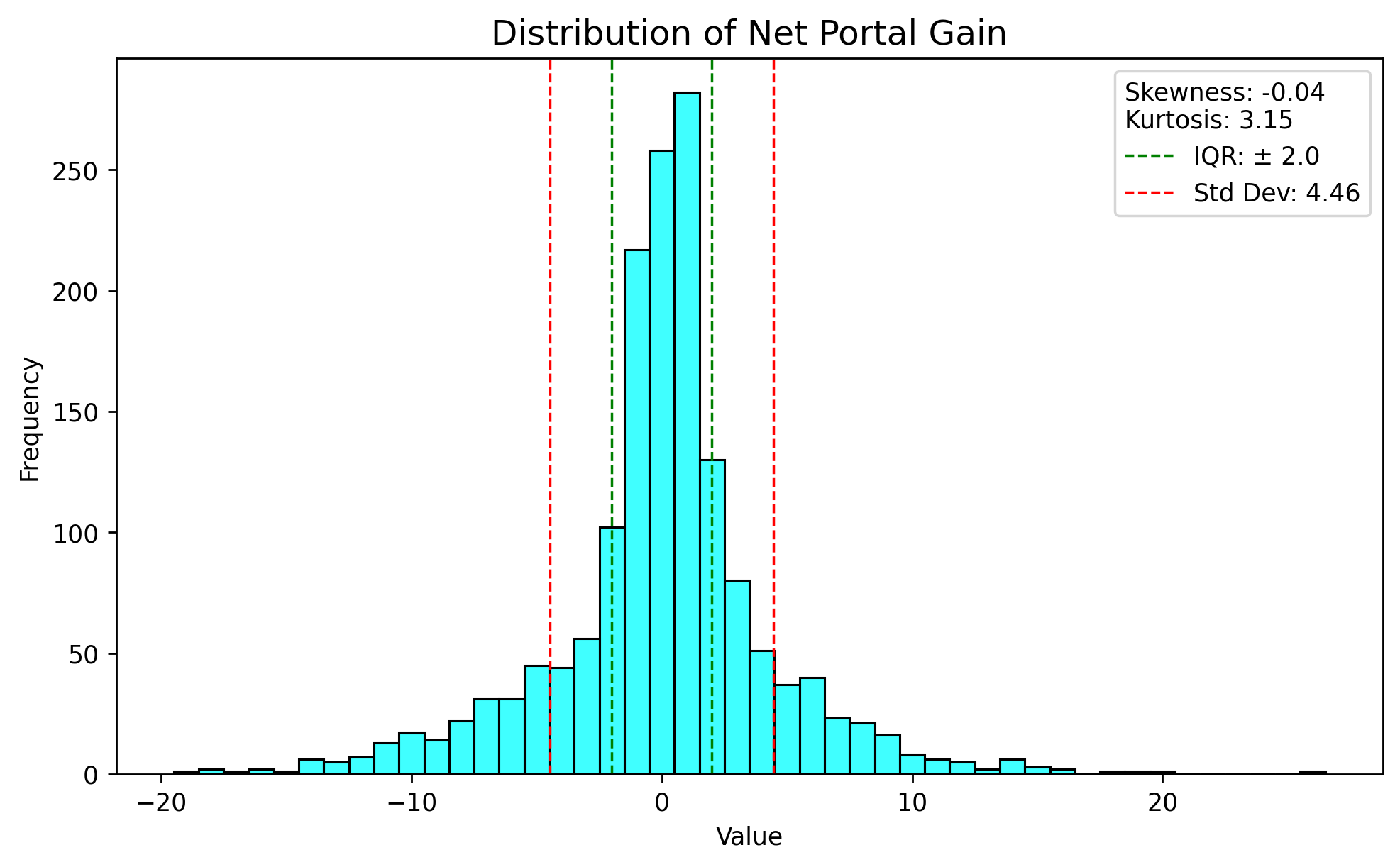
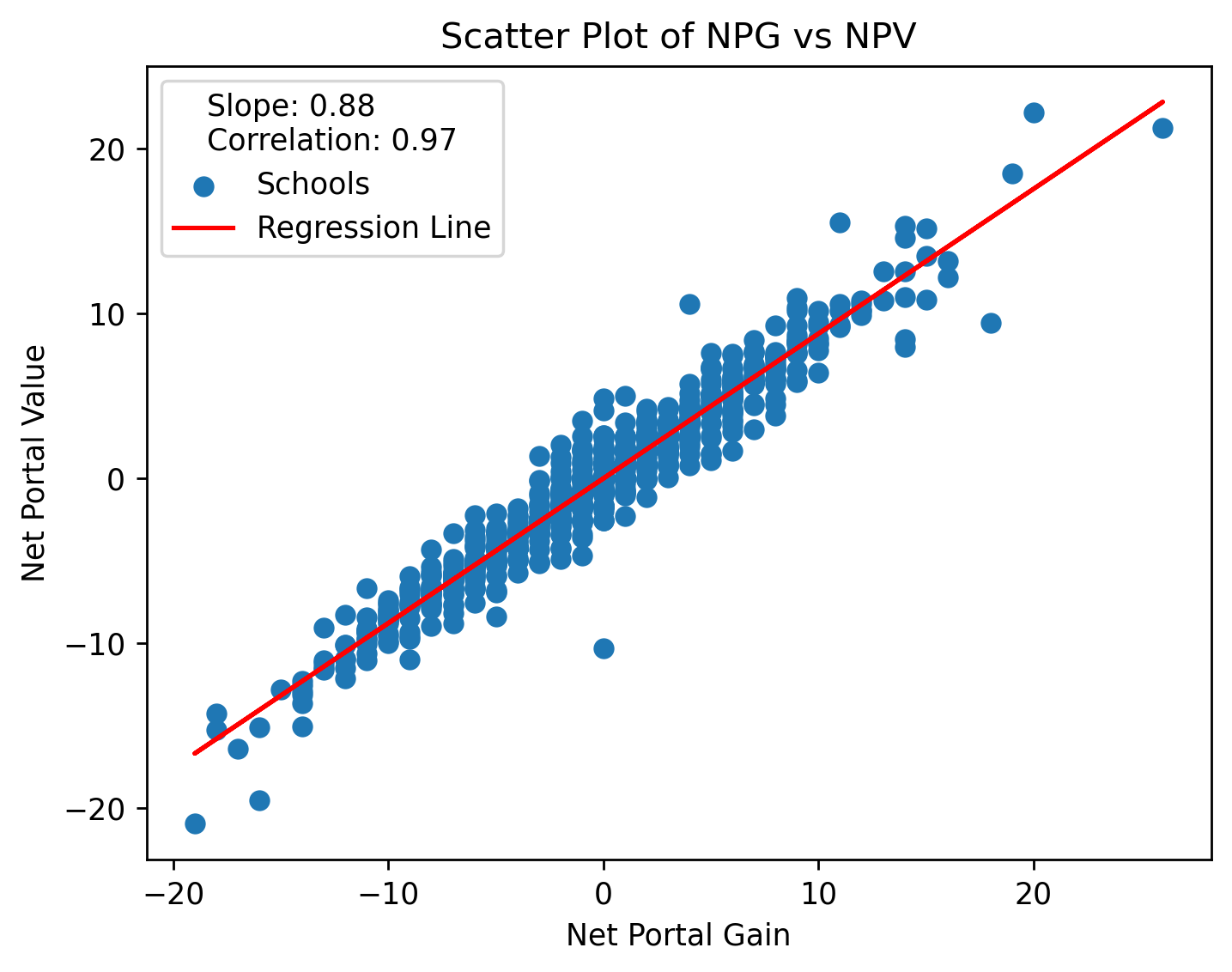
Since we are dealing with a directed network, we can take advantage of in-degree and out-degree (incoming vs outgoing transfers) to create two simple node-level metrics. We’ll call them “Net Portal Gain” and “Net Portal Value,” or NPG and NPV. NPG is just the net degree – the number of in-transfers minus out-transfers for a node – and NPV is the same but with player rating.
This is the distribution of NPG for all five years.
When we isolate the top and bottom schools by aggregate (summed) NPG over the entirety of the portal’s existence, we get something interesting.
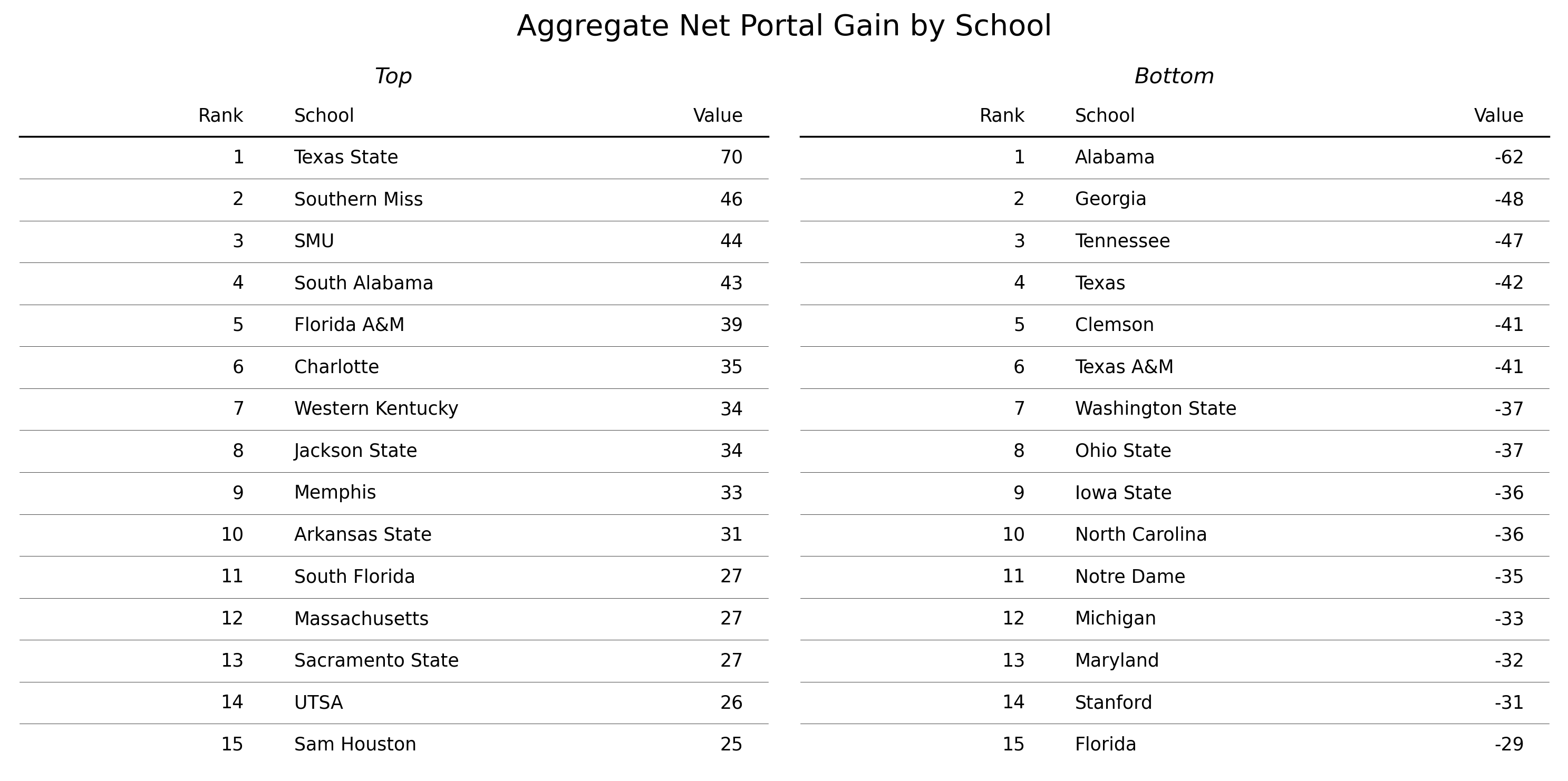
The bottom 15 is filled to the brim with blue-bloods, some of the most successful and prestigious programs of the past 25 years. These programs are being drained of players at an astounding rate. Meanwhile, the other side consists mainly of much-less-prestigious G6 schools which are happily soaking up the difference.
This is odd because it suggests at first glance that there may be some sort of inverse relationship between portal intake and program success. The answer is more nuanced, however, and we’ll get to that soon.
So what about NPV? As you may have already guessed, change in NPV is driven almost entirely by change in NPG. This is because the range of ratings is very tight, at 0.75-0.99, meaning most of the difference in raw NPV is being driven by pure volume.
If we control for NPG and isolate the effect of NPV, however, we get this:
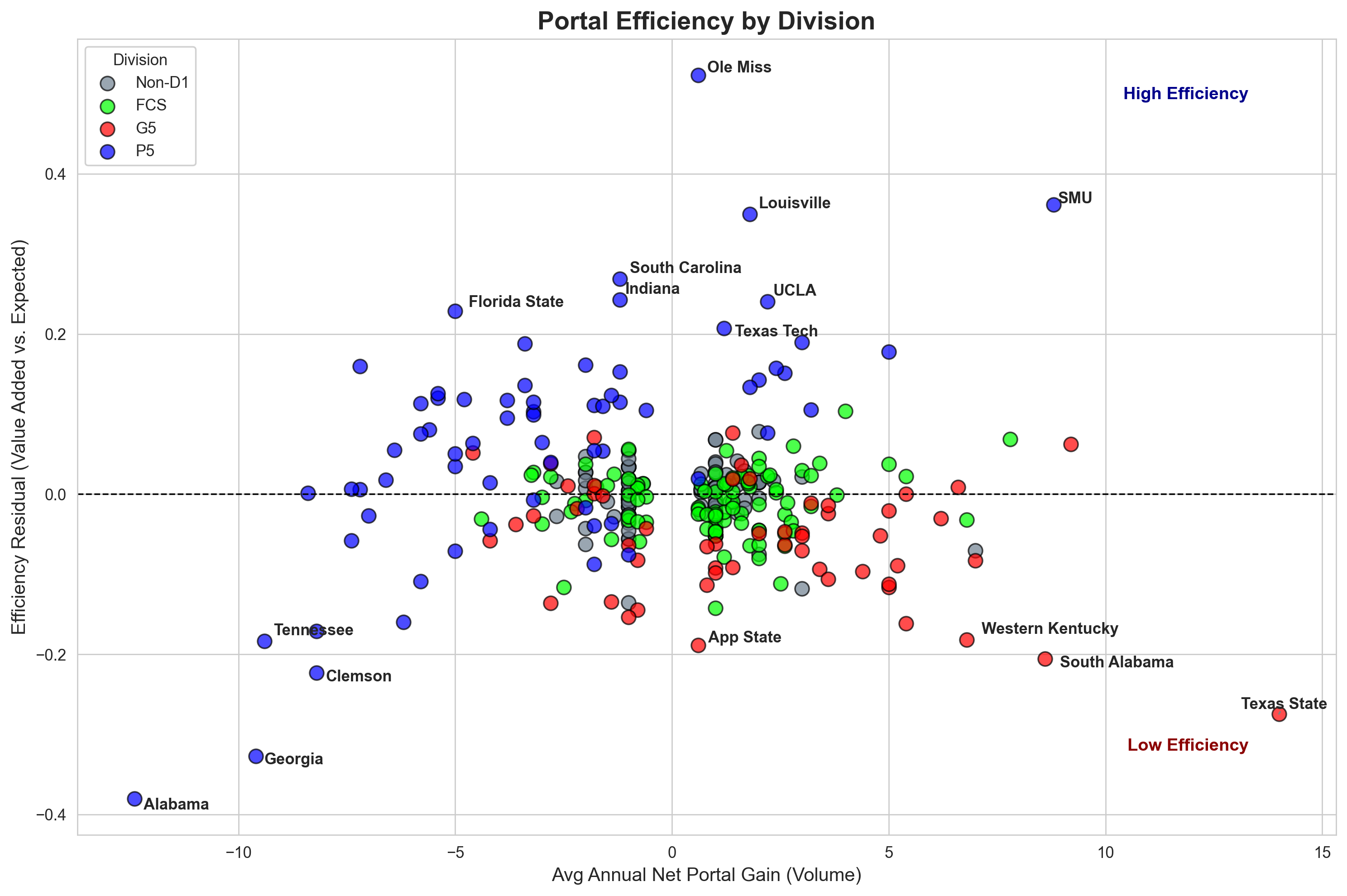
This is a chart showing, on the x-axis, average NPG, and on the y-axis the difference between expected value added (based on their NPG) and the actual value they did add. Schools are colored by division and the top/bottom 8 are labeled. Interestingly, it seems to be stratified mostly within-FBS; P4 schools are generally getting more “bang for their buck” while G6 are getting less.
This pattern notably holds more for G6 than P4, though. The top 8 are all P4, while the bottom 8 are evenly split – with Alabama and Georgia, especially, getting clobbered in the portal both by volume and relative value.
Let’s try digging some more into that NPG result from earlier.
This is a Sankey diagram, made for visualizing flow rates. Used here, it shows all the journeys made by transferring players over the past five seasons by division. We can see that in general, lower divisions have more total inflow than outflow, while P4 shows the opposite (Here’s a link to a version that further subdivides by conference, if you’d like to check that out as well).
Taken together, these charts reflect a pattern where (most) P4 programs trade quantity for quality, hemorrhaging a massive amount of volume while at the same time bringing in a small quantity of nevertheless elite talent.
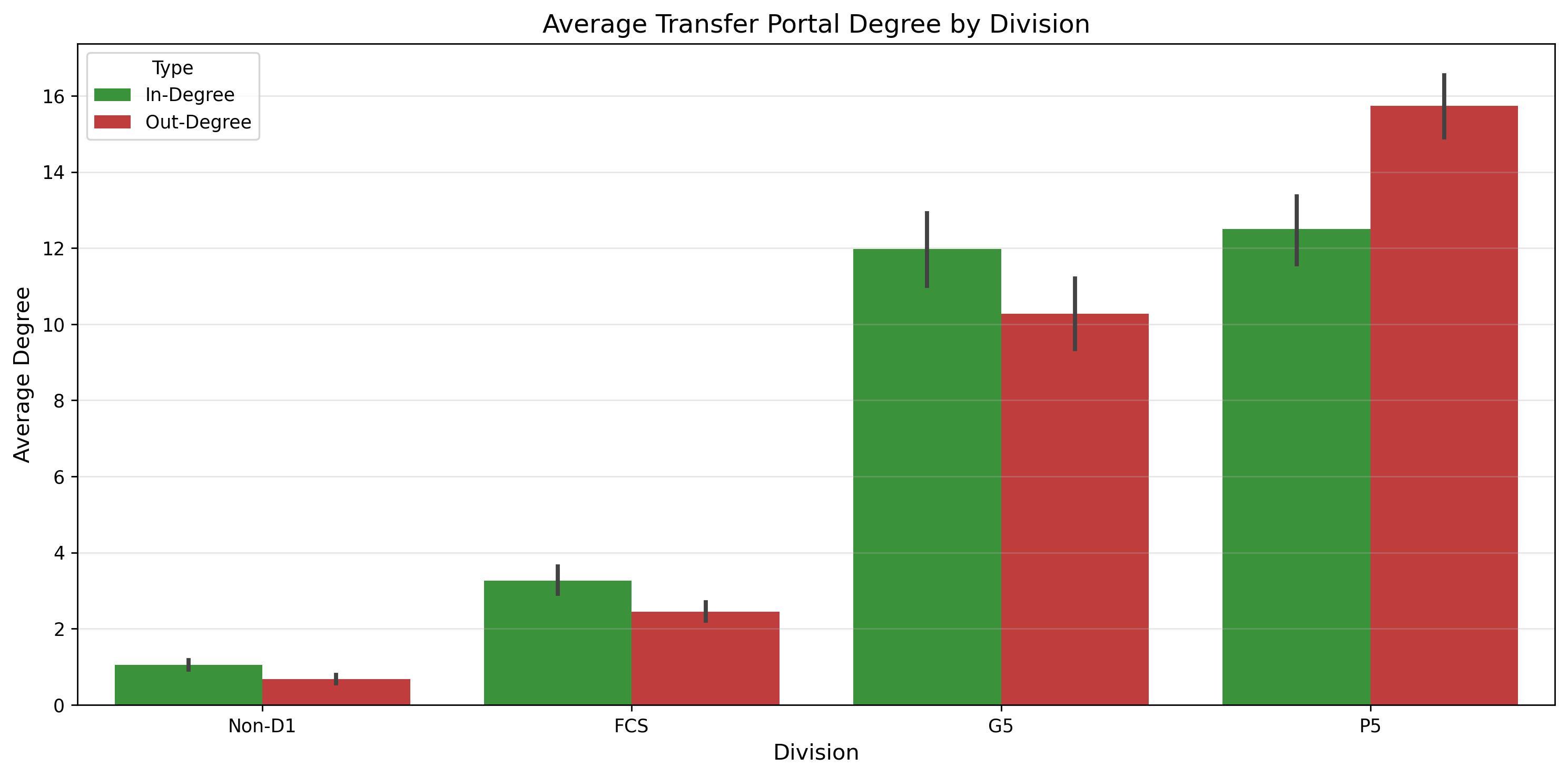
We can also look at in-degree and out-degree in isolation, allowing us to see who’s gaining and losing the most in absolute terms without considering the ratio.

IV. Interpretation
So what does this all mean? Anecdotally, most of can just kind of “feel” that there’s more parity now than there used to be. Indiana’s meteoric ascent would not have been possible without the likes of transfers Fernando Mendoza and Elijah Sarratt. Vanderbilt’s sudden and remarkable rise from the depths of mediocrity was spearheaded by quarterback Diego Pavia, another transfer. The last time any of the four teams remaining in the playoff (at the time of this writing) ever won a championship was 2001. So does the data agree with the gut in this case?
The results of our network analysis suggest that there are competing dynamics at play. Top recruits still cluster at a small number of elite programs, but now, with the advent of the portal, these programs can no longer hoard them several layers down on the depth chart. Since these players are still quite good, they are valuable on the market and well able to transfer elsewhere, which cannot necessarily be said for backups at lower-tier programs. Notwithstanding several notable exceptions, transfers are statistically far more likely to be moving down than up; it’s just that we don’t hear about them as often.
To top it all off, we can do a quick, straightforward comparison to see directly how parity has changed since 2021. We can’t use ratings for this because they remain static unless a player enters the portal (at which point they have a different meaning anyway), so we’ll have to use the next best thing: PPA, or predicted points added, essentially an adaptation of baseball’s EPA to a football context.
PPA, unfortunately, can only be calculated for offensive skill players due to the notorious difficulty of quantitatively measuring performance for defensive players and linemen. This requires us to make the assumption that variance in performance (via PPA) for offensive skill players is proportional to variance in some hypothetical measure of “performance” for everyone else, or in other words that variance for skill players is representative of variance for all players. I think this is probably a reasonable assumption.
Using PPA as a proxy for player quality and summing it for each team in each year, we can then take the coefficient of variation for each year and compare its values before vs. after the introduction of the portal. Doing this, we observe that parity does in fact seem to have increased since 2021.
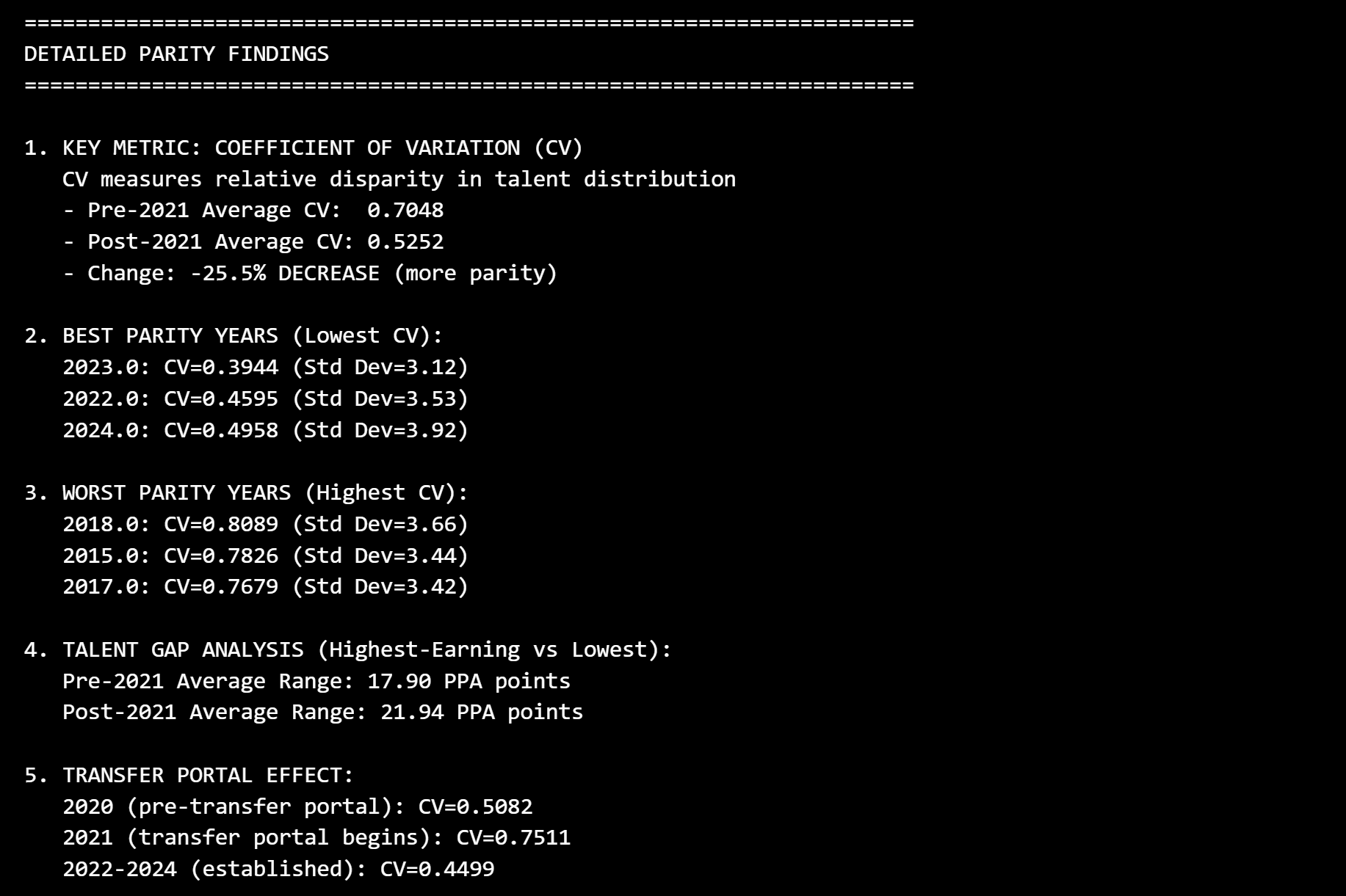
Of course, it’s important to point out that the sample size of completed post-portal years is just 4, and there are confounding variables at play here – most notably the other changes that happened concurrently – but we have a good enough mechanistic explanation via the transfer portal to say that it is likely to be the primary factor. While top programs are still getting the very best – and indeed may be getting even higher top-end talent – the difference in talent between the players they’re losing and the players they’re gaining is not enough to make up for the loss in volume. These programs always had the best players, but now their overall share of the best players is smaller.
Combined with the status of “mid-tier” programs as go-betweens for rising stars in lower divisions and FCS, the net effect of the portal seems to indeed be an increase in parity.
The transfer portal is often derided as a degradation of the sport, but the analysis of its network tells a different story: one of a system finally finding its equilibrium. The portal has acted to “unclog” the talent distribution, allowing freer circulation and clearing buildups that previously stood in the way of new teams rising to the top.
So there you have it. The portal has clearly been a positive influence, but the sledgehammer of realignment is a heavy weight to bear on the other end of that scale. The answer as to where the balance of will ultimately land for college football is still foggy, but we can no longer say the portal is contributing to its downfall; in fact, it may turn out to be the most important counterweight we have.
The Recruiting Network: Visualizing Pipelines
I promised I’d get to recruiting, so here we are. I must admit that I didn’t end up getting to do nearly as much with this as I would have liked, but I was still able to obtain at least one very interesting result that I think is actually the most exciting one I got, despite being secondary to the main project.
As a reminder, the recruiting networks consist of teams that recruited from the same locations in the same year, with edges weighted by the number of times they did so.
This one turned out to be more of a small-world topology, with high clustering and a short average path length. Here are its aggregated statistics and degree distribution, which is best approximated by a one-tailed bell curve (with a predictable jump at 0 for recruits from remote areas). This distribution likely just reflects the fact that teams have a limited number of scholarship offers they can make per season.
| Metric | Value |
|---|---|
| Average Path Length | 2.026 |
| Diameter | 4.3 |
| Average Degree | 22.77 |
| Average Clustering Coefficient | 0.45 |
| Density | 0.14 |

Since this is a network with high clustering, we can do something really cool: community detection. Community detection is the practice of finding collections of nodes that cluster together in relatively siloed-off groups. The majority of algorithms used for this purpose work by maximizing, in some way or another, a metric called “modularity,” which is essentially the difference between the number of edges you observe within a node grouping and the number you would expect to observe if the network were generated randomly.
The Louvain algorithm is one such method, and the one we will use here. It works by grouping nodes together until it can no longer increase the grouping’s modularity score, then combining those groupings into one entity, treating them as “nodes,” and applying the same process, alternating between stages until no further change can increase modularity. Applying it to our averaged network and again visualizing it with the Fruchterman Reingold algorithm, these are the communities that emerge:
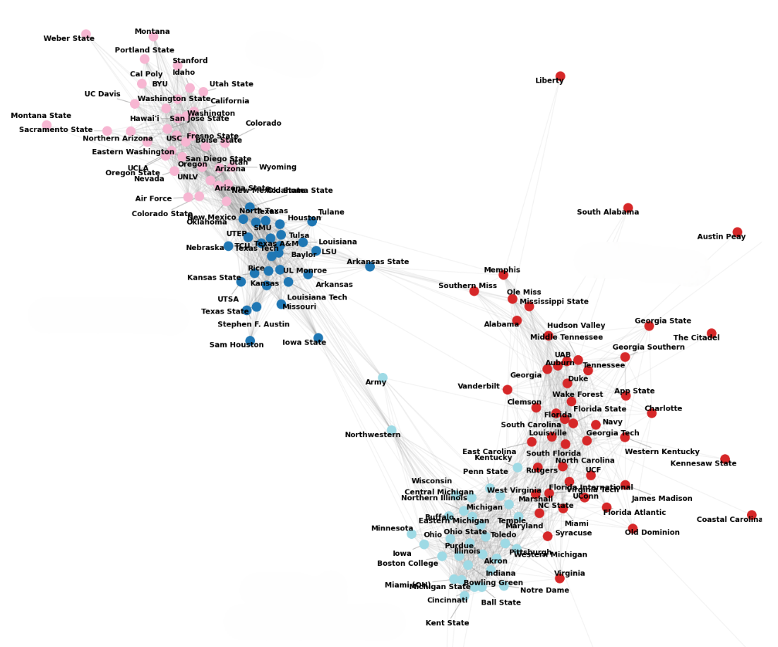
See anything? Let’s try adding labels to the communities:
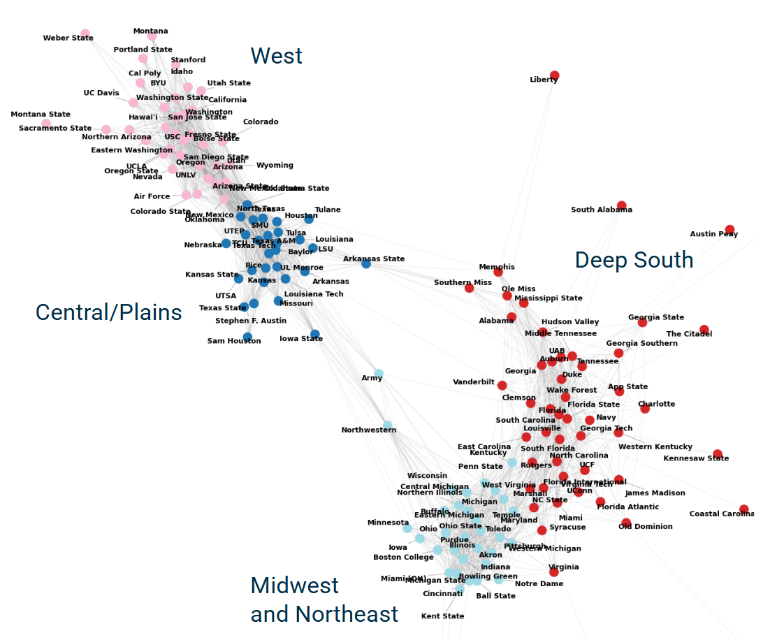
What you’re looking at is the physical manifestation of recruiting pipelines in “graph space,” drawn from real-world data stretching back 24 years.
Not only do we observe four clear partitions, we can easily see – thanks to our visualization algorithm – that these four communities are in fact subregions of two highly-distinct pipelines, which just happen to correspond almost perfectly with the two sides of the Mississippi River.
What’s striking here is just how far apart the communities are. Generally when doing community detection, there’s some ambiguity about where to draw the line. Not so here. In this case we have two communities – East and West – that are so clearly demarcated that we didn’t actually even need the community detection algorithm to see them (though it helps with further decomposing them). In other words, it is very nearly impossible for these to have emerged by pure chance, meaning that recruiting truly is divided into two major meta-pipelines, and moreover so clearly divided as to be impossible to dismiss.
Looking at individual schools, we can see some interesting things as well. For instance, we can see that Iowa and Iowa State actually operate in entirely separate recruiting pipelines despite being less than 50 miles from eachother – likely owing both to their central location and long period of playing in separate conferences. We can also see that Army, Northwestern, and Arkansas State occupy “broker” positions in-between communities, where they have the seemingly rare privilege of recruiting from both.
I certainly expected to see some meaningful communities when I ran this algorithm, but this is on another level. As far as I’m aware (though I may be wrong), this is the first time these particular communities have been discovered and visualized, which is really cool.
So that’s it; I hope you enjoyed, learned something, etc, etc.
If you’d like, you can check out the project repo on my GitHub. CFBD’s terms and conditions prohibit me from publishing the data directly, but the code’s all there to re-gather it with your own API key. If you decide to expand on the project, let me know! There’s a ton more that could be done here and I’d love to see what else people think of.